 Marshall J. Jones
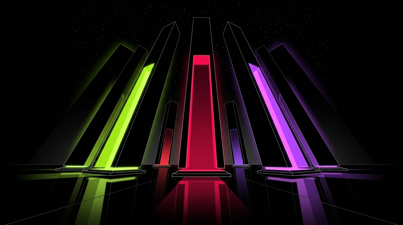
The human eye does not just see color; it reacts to it chemically. When a viewer scrolls through a feed, their brain is scanning for signals that promise a reward. This is the dopamine loop in action. If your palette is muddy, low-contrast, or predictable, the brain marks it as "noise" and moves on.
To stop the scroll, you need to understand how specific color frequencies interact with the brain's reward system. This isn't about making things "pretty." It is about biological calibration. You are tuning your visuals to trigger a specific neurochemical response before the viewer even reads your headline.
The Science of Visual Rewards
Dopamine is the neurotransmitter of anticipation. It spikes when we encounter something novel, high-contrast, or visually "clean." In the context of digital media, certain colors act as shortcuts to this response.
High-saturation hues, particularly in the warm end of the spectrum (reds, oranges, and yellows), are perceived faster by the brain. They demand immediate attention because, evolutionarily, they signaled fruit, fire, or danger. When you use these in a digital interface, you are hijacking that ancient hardware.
Why High Contrast Wins
Contrast is the primary driver of visual clarity. When the brain can easily distinguish an object from its background, it uses less processing power. This "cognitive ease" is inherently satisfying. It is one reason why satisfying content often uses bright objects against neutral or dark backdrops.
| Color Property | Dopamine Impact | Best Use Case |
|---|---|---|
| High Saturation | High (Arousal) | Call-to-action buttons, key data points |
| Complementary Contrast | High (Clarity) | Thumbnails, title cards |
| Analogous Schemes | Low (Calm) | Backgrounds, long-form reading areas |
| Luminance Flips | Very High (Novelty) | Transition screens, "Reveal" moments |
Building a "Dopamine Palette"
You cannot just throw neon colors at a screen and hope for the best. Overstimulation leads to "visual fatigue," where the user closes the app because their eyes actually hurt. Calibration requires a balance between the "hit" (the bright color) and the "reset" (the neutral space).
1. The 60-30-10 Rule for Digital Feeds
To maintain engagement without causing burnout, follow this ratio:
- 60% Neutral/Dark: Usually your background. This sets the stage and prevents eye strain.
- 30% Secondary Color: A brand color that provides structure.
- 10% Dopamine Pop: A high-vibrancy accent color used only for the most important information.
2. The Power of "Electric" Purples and Pinks
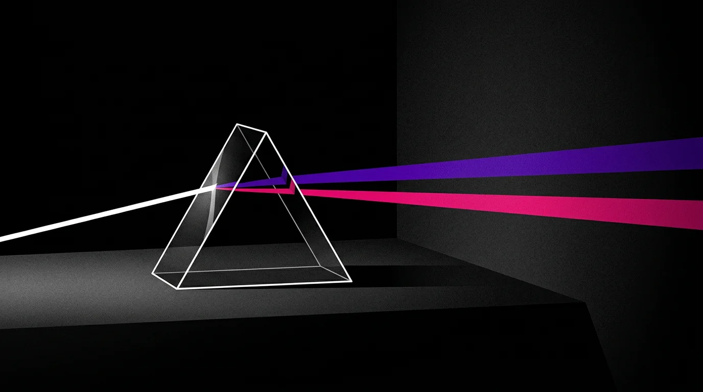
There is a reason why many top-tier apps and streaming platforms use gradients of purple and pink. These colors rarely occur in large quantities in nature. In a digital environment, they signal "newness" and "technology." They feel artificial in a way that captures the modern eye's demand for novelty.
Calibrating for Specific Platforms
Different platforms have different "baseline" colors. To stand out, you must contrast against the platform itself.
- TikTok/Reels: The interface is dark/translucent. Use "Hyper-Yellow" or "Cyan" to cut through the UI overlays.
- YouTube: The background is often white or true black (Dark Mode). High-contrast red and white thumbnails are classic, but "Lime Green" currently has a higher click-through rate because it is less common.
- SaaS Dashboards: Use "Signal Blue" for progress and "Pulse Green" for success. Avoid red unless something is genuinely broken.
Color Mapping Checklist
Before you publish your next video or design, run through this checklist:
- Does my "Pop" color have at least a 7:1 contrast ratio against the background?
- Have I limited my palette to 3 main hues to avoid visual clutter?
- Is the most important information (the "Reward") the brightest part of the screen?
- Did I avoid "Muddy" transitions? (Gradients that pass through gray/brown).
The "Glitch" Effect and Pattern Interruption
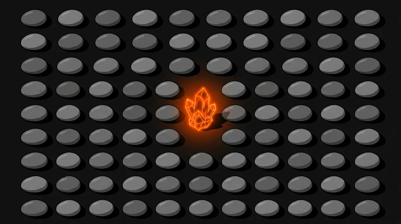
Dopamine is also triggered by pattern interruption. If a viewer sees a perfect, harmonious palette, they might find it beautiful, but they won't necessarily feel an urge to click. Introducing a "discordant" color—a color that technically shouldn't be there—creates a micro-moment of tension.
For example, if your brand uses a sleek blue and silver palette, adding a single, tiny element of "Safety Orange" creates a visual itch that the brain wants to scratch. This tension keeps the viewer engaged longer as they subconsciously try to resolve the visual anomaly.
Testing Your Palette
Don't guess. Use tools to verify that your colors are doing the heavy lifting.
- The Squint Test: Look at your design and squint until it’s blurry. What is the only color you can still see? That is your dopamine trigger. If you see nothing, your palette is too weak.
- Grayscale Check: Turn your monitor to grayscale. If your call-to-action disappears into the background, you don't have enough luminance contrast. Color is secondary to brightness when it comes to the brain's "Attention Filter."
- A/B Saturation: Try one version of your asset at 100% saturation and one at 85%. Often, 85% performs better for long-term retention, while 100% wins for short-term clicks.
Avoiding Visual Fatigue
The danger of dopamine-driven design is the "crash." If every frame of your video is a neon explosion, the viewer will eventually tune out. This is known as sensory adaptation. To keep the dopamine flowing, you must vary the intensity.
Think of your content like a song. You need the quiet verses (desaturated, calm colors) to make the chorus (the high-saturation dopamine hit) feel powerful. If the whole song is a scream, nobody hears the melody.
| Phase | Strategy | Visual Goal |
|---|---|---|
| The Hook | Maximum Contrast | Stop the scroll immediately |
| The Meat | Analogous Harmony | Keep the user comfortable while they consume info |
| The Payoff | Saturation Spike | Reward the user for finishing the content |
Conclusion
Calibrating your color palette is not a decorative choice. It is a functional one. By choosing high-frequency colors, maintaining strict contrast ratios, and using the 60-30-10 rule, you create a visual environment that the human brain is hardwired to prefer.
Stop picking colors because you like them. Start picking them because they work. When you align your aesthetic with the viewer's neurochemistry, engagement isn't just a goal—it's a biological certainty.